Background
In December 2017, my manager, Laura Bowden, formed FCAT Client EXPRESS, and invited me to join her on this new venture. FCAT Client EXPRESS is a UX research agency designed to serve Fidelity’s corporate clients and internal tech incubators.
When we soft-launched in December 2017, our team of two had a steep learning curve. Laura focused on managing the financial and operational sides of the business, and we tag-teamed business development. I assumed the roles of marketer and designer.
For our first several months, we used a Powerpoint deck to present our demo. It was problematic. First, it forced us into a linear presentation flow, which didn’t always fit our client conversations. Some of our clients were small investment advisory firms who needed a primer on UX, while others were Fortune 100 organizations with deep expertise in the space. Second, we wanted to use video to demonstrate how each of our methods work; adding video to a Powerpoint bloats the file to the point that it can’t be shared via email. Third, Powerpoint lacks the flexibility to work as a presentation tool and a self-guided experience simultaneously. And finally—let’s face it—it just isn’t slick.
We wanted a demo that would be flexible, dynamic, shareable, and impressive.
PPT: Booooooooorrrrr-ing
Process
Our first task was to find a tool or platform on which the demo would live. Laura & I explored presentation tools like Prezi and SlideCamp, but Fidelity wouldn’t let us use those. Mural.ly could link directly to videos hosted on YouTube, and we loved how zooming in and out would enable us to customize the level of detail we cover in the presentations. So I created a proof of concept.
My first challenge was to make navigation through the demo flexible but also smooth during presentations. I didn’t want jarring movements to distract the audience during the more linear parts of the demo. Jumping from the end of one row or column to the start of the next was glitchy, so I tried a spiral design. The presenter would start in the upper left corner and proceed around the board, zooming in at each turn. Then, at the end—where client comments directed us around our research methods, we’d navigate around an inner rectangle.
The failed Mural proof of concept: ugly, rigid, no video. Nope!
This option was a total fail. Mural is not meant for pixel-perfect design, and aligning elements was a frustrating disaster. Additionally, this design was fragile; if we wanted to change anything, the entire board would need to be re-worked. The only way to share outside of Fidelity was by exporting a PDF, which would require self-guided users to figure out how it worked and zoom in and out. And finally, Fidelity would not allow us to host videos on YouTube, so the video feature would have to be scrapped.
Hard pass.
We had initially considered designing in Sketch and building an InVision prototype for the demo, but because InVision wouldn’t enable video, we had moved on. After the Mural fail, I revisited Sketch/InVision and learned that it was possible to upload a GIF. Could I make method-illustrating videos short enough to work? Only one way to find out!
Well, it took a couple days of messing with Sketch and Camtasia and Snagit and InVision, but the answer was ultimately “yup!”

A 20-second GIF illustrating a 5-second study
Next, I turned my focus to information architecture. Laura & I had a brainstorm to define our categories of content and labels. We captured our ideas in Mural (which is bad for a demo but wonderful for brainstorming). And then I built a few versions of the site map, also in Mural.
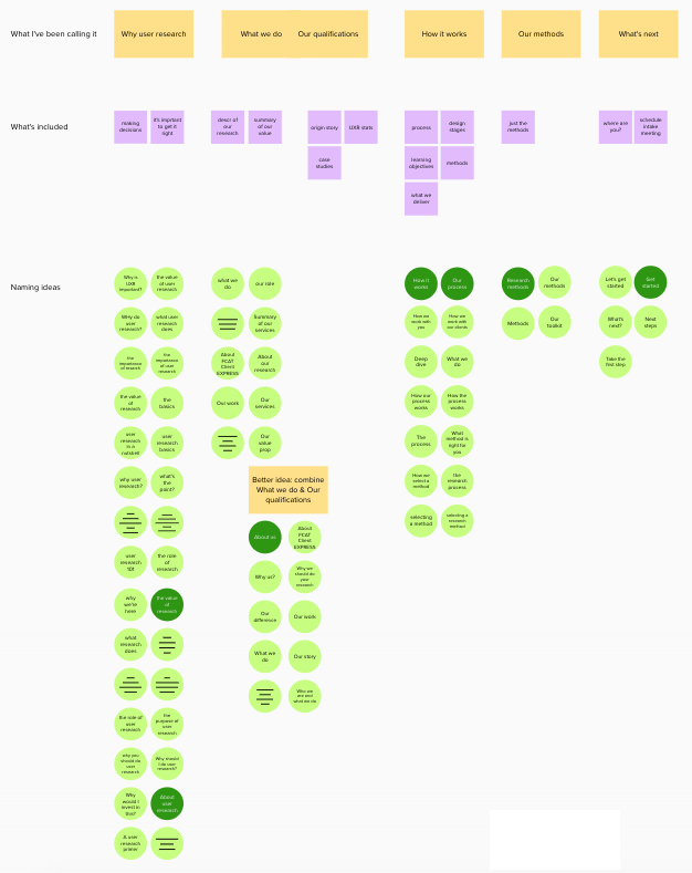
A brainstorming Mural on information architecture and labeling
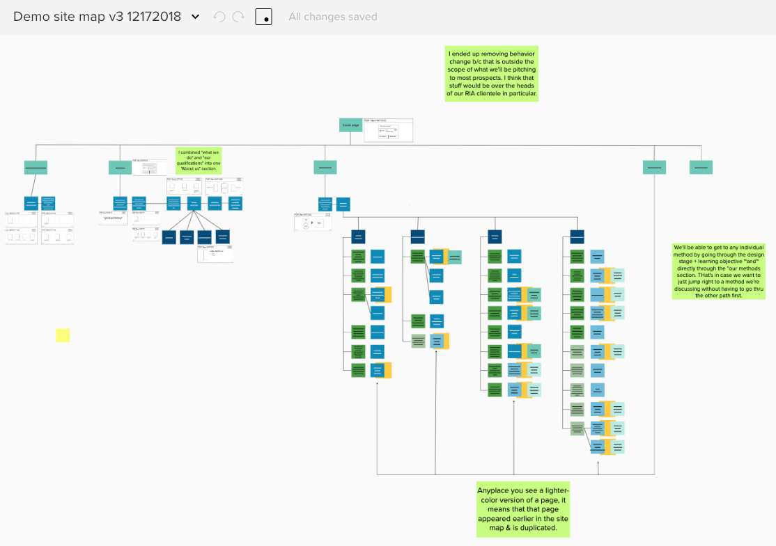
One version of the site map, also in Mural
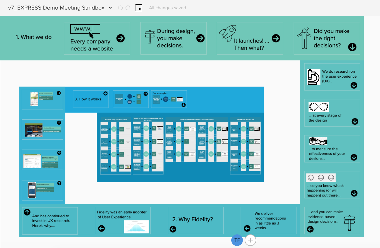
Then I sketched out a bunch of possible navigation designs and put them into Balsamiq wireframes. I started with a block thing, which was more amenable to jumping around than a traditional linear menu.
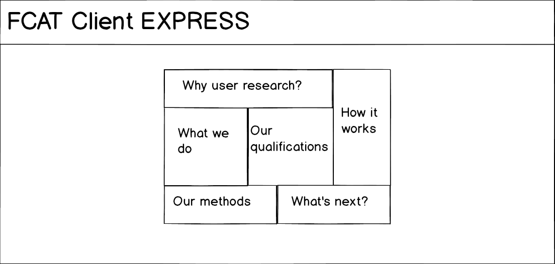
The proposed navigation block
Laura & I were into this concept, so I incorporated it into a more thorough set of wireframes.
Wireframes using the proposed block navigation
Upon further thought, however, this navigation design failed the fragility test. I didn’t want to have to redesign the entire prototype if our services changed a little bit. So we went with a more traditional approach. And indeed, as time went on, I added many pages to this design and even added a sub-navigation menu to the methods page to better align with our client conversations.
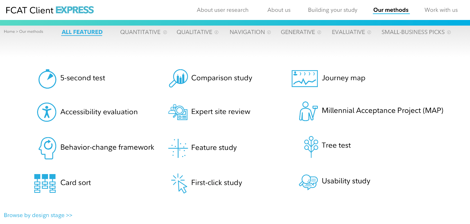
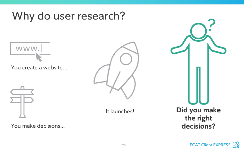
This is the main navigation page…
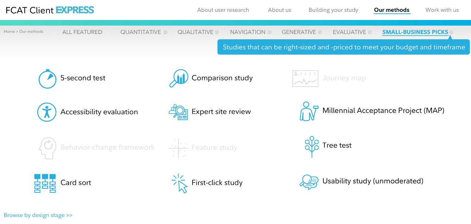
… And this is how the sub-navigation lets us tailor the conversation to the audience.
Results
I could go on and on re: the decisions that were made in the creation of this demo. The final product is far from perfect—it’s not mobile-friendly, there’s a funky navigational thing happening in one section, etc.
But it does enable Laura & me to:
- Tell the stories that make sense for diverse clients
- Adapt to the conversations our clients want to have
- Demonstrate how our methods work with short video clips, and
- Share seamlessly with internal and external stakeholders.
Here it is: https://fidelity-fcat.invisionapp.com/share/NPALIDHYZS8#/screens
