Background
This was a simulated project for an Information Architecture class at Bentley. I chose LonelyPlanet.com for this project so I could redesign a complex site with some familiar challenges (I used to work for Frommers.com, and the CMS was a point of fascination for me).
Process
Phase 1: Project Overview
Before beginning, I defined the goals and scope of the LP.com redesign. The main priorities were to simplify and prioritize home page items and to make destination navigation consistent and intuitive.
Phase 2: Expert Review
User research was out of scope for this class, so I conducted an expert review to isolate the strengths and weaknesses of the existing site before proposing changes. The review was organized by site structure, navigation (including browsing and search), content, page layout, and workflow, with the majority of the analysis concentrated in the first two sections.
LonelyPlanet.com is doing plenty right: it’s a beautiful website, with gorgeous travel photography and top-notch inspirational content. Advertising is present but not overwhelming, and search is well executed.
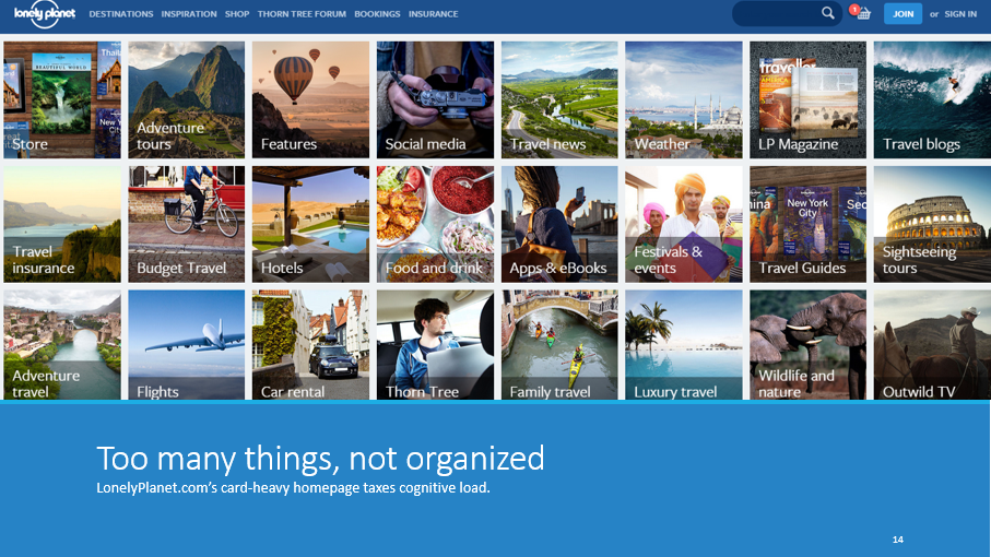
But where it falls short is in organization. It can be difficult to find target destinations and points-of-interest content.
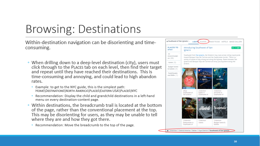
The home page and several landing pages lack organization schemes and ordering principles, making them disorienting.
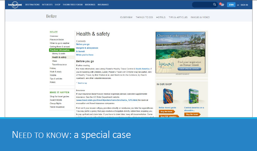
Finally, one section of the destination guides–Need to Know–still follows LP.com’s old design and needs to be updated.
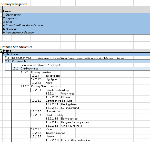
Phase 3: Site Map
While I suggested some minor changes to other sections of LonelyPlanet.com, the vast majority of the work done was on the Destinations section of the website. I settled on a six-tier taxonomy of destinations:
Continent > Country > Region1 > Region2 > Region3 > City
Within destinations, taxonomy was limited to the types of content travelers are likely to seek based on the destination tier:
Continent: Introduction + Highlights + Child Countries
Country: Overview + Need to Know + Tips + Images + Child Regions
City: Overview + POIs + Accommodations + Need to Know + Tips + Images
Phase 4: Annotated Wireframes
For the final phase of the redesign, I created four annotated wireframes in Axure: Home Page, Destinations Landing Page, Region Landing Page, and City Need to Know.
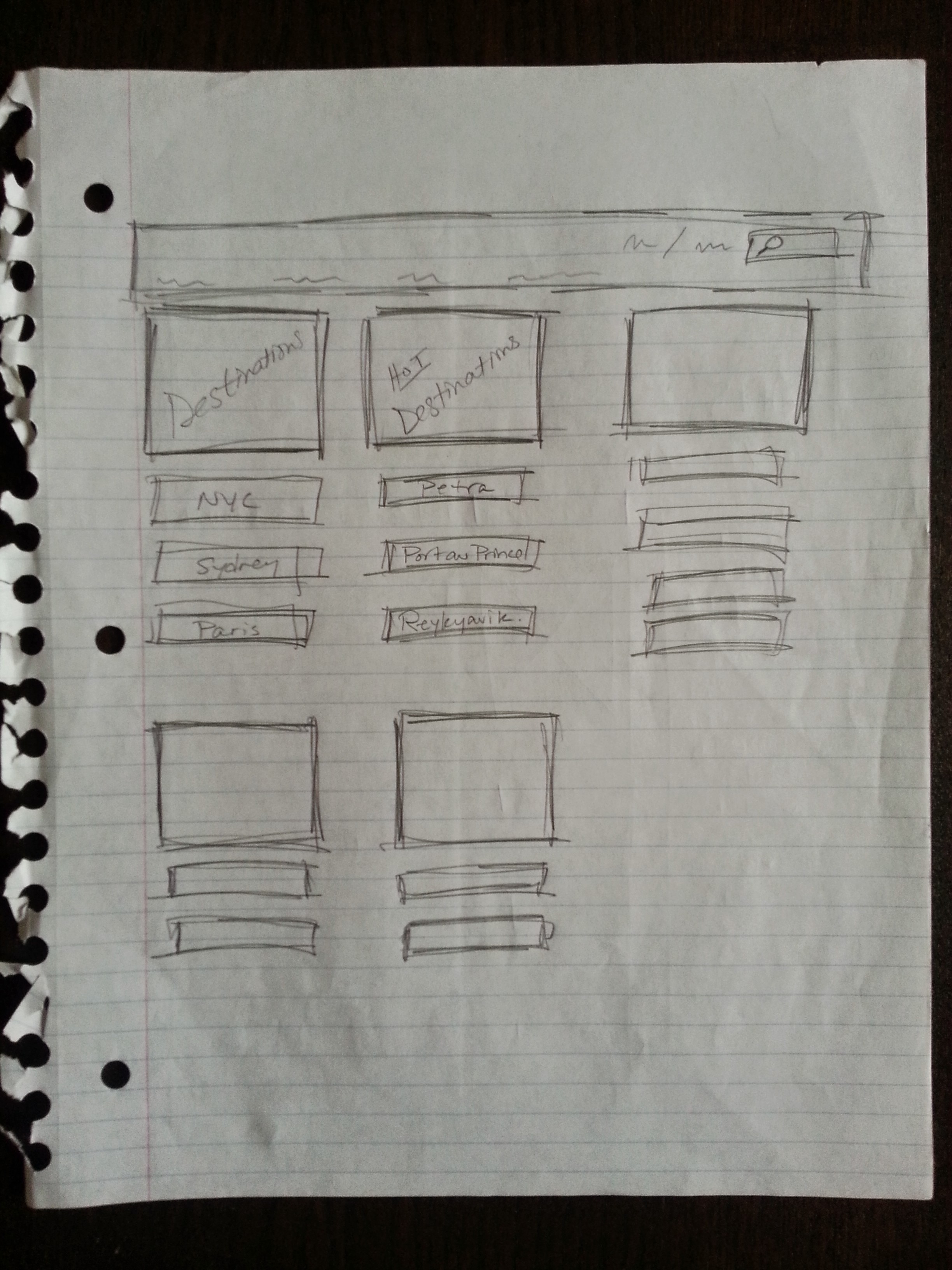
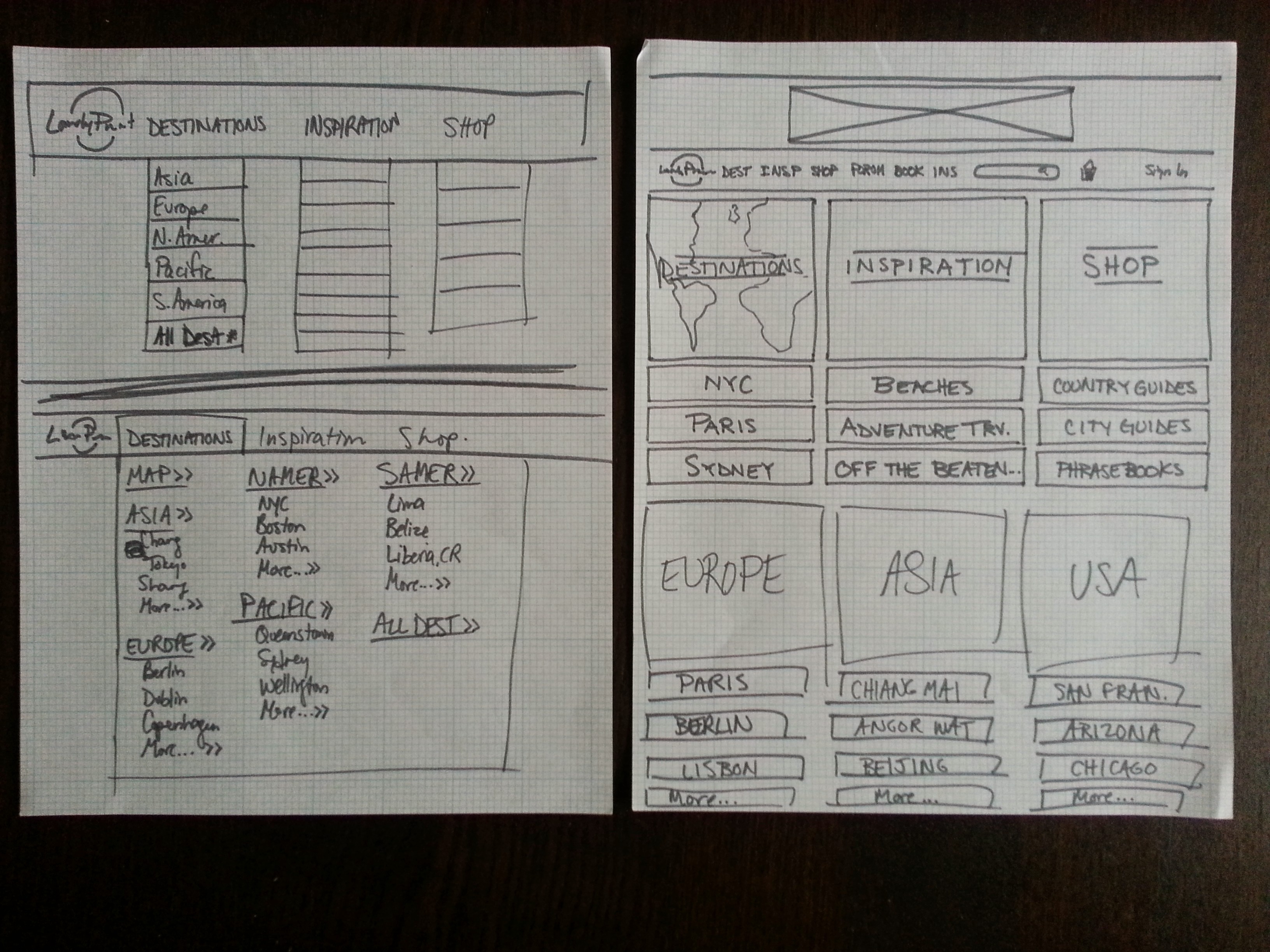
But first, I started sketching…
Below are the final wireframes; you can look closer and see the annotations at bit.ly/FlynnWireframes.
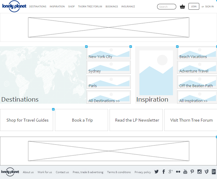
Home Page
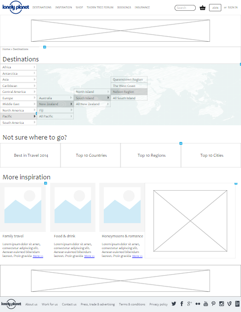
Destinations Landing Page
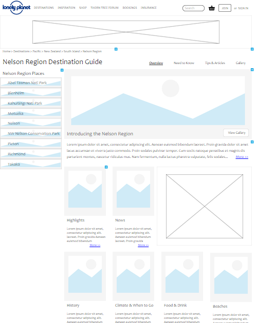
Region Landing Page
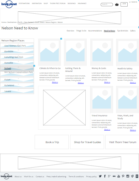
City Need to Know
Results
I received a 4.0 for this project. Here’s an excerpt of the professor’s feedback:
Excellent job Tracy. Between the IA and the navigation improvement, this site is much more manageable to navigate around and to find locations. Specifically:
– Flyout menus are great. They make navigating easier for those who know they want to go, and for those who don’t – they can browse without having to navigate to a page if they don’t want to.
– Breadcrumbs: Breadcrumbs are essential for a site like this…. And seeing the hierarchy… makes it much more likely that users will remember how to get back to this location.
– Left nav for region. Making this fixed on the page is great because user will likely want to browse the other regions and this “fixes” them in one place.
Page layout: You did an excellent job on the page layout. Very thoughtful. Your page elements are much more efficient but equally effective in promoting content, but allowing users to dig deeper….
Great work – this was not an easy site to take on, but you did a great job.
